Logos & Marks
The following logos and marks are within the scope of the brand:
![]()
![]()
![]()
Seal & Logotypye
The Seal is the primary mark of the School. It appears on all official Cate materials. When possible, the Seal should be used with the logotype. In most cases, the seal and logotype should be centered vertically but where space is limited, the Seal and logotype can centered horizontally.
Color
The seal should appear blue on a white background or white on a blue or black background wherever possible. This applies to primary brand applications such as website headers, email, advertising, and marketing materials. When using 2 or 1 color the seal should appear in black or white.
Size
The seal should not appear smaller than an 7/8” . In cases where the seal needs to be smaller, the wordmark should be used without the seal.
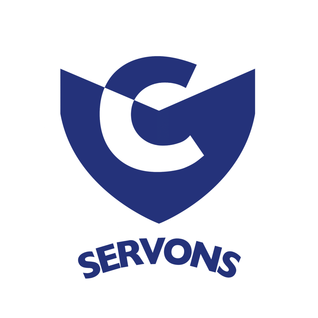
Servons Shield
The Servons Shield is a secondary mark of the School used primarily for large-scale applications, like signage, and in merchandising and athletic gear. The Shield can only be used when the Cate School logotype or wordmark are also incorporated into the design of the item.
Color
The Shield should appear white and blue on a light gray or light blue background wherever possible. In some cases, the Shield could be applied over a photo that does not contain a lot of detail. For merchandizing, a royal blue or similar dark blue shade may be utilized in lieu of the official Cate blue.


Cate Wordmark
The Cate Wordmark is a secondary lockup used primarily in print and digital materials. It can also be utilized in any designs that utilize the Servons Shield
Color
The Wordmark should appear blue on a white background or white on a blue background wherever possible.